Qmin

14 May, 2010

We went to a new restaurant tonight.

(By “new”, I mean one we haven’t visited before. It’s actually been there for years, just beyond our normal walk-from-home restaurant circuit.)

Qmin is an Indian restaurant, with a mid-range style. The menu was interesting, with a good mix of the classic Indian favourites you’d expect, plus some new and interesting house specialties that show the chef is applying a bit of creativity. We started with semolina-crusted eggplant circles, served with a coconut chutney, then moved on to a coconut lamb curry and some classic black dhal with rice and peshwari naan. We can’t go past a peshwari naan – the sweetness of the nuts and fruit in the bread is just too addictive. And this one was really good – possibly the best peshwari naan I’ve ever tasted, and I’ve had a lot of them. The eggplant entree was very nice, as was the dhal, though next time I go here I think I’ll try something other than the lamb again.

One thing I noticed was the large window giving diners a view of the workings inside the kitchen. I’ve seen this before in other restaurants, and I just realised that it seems to be a feature of Indian restaurants in particular. I mentioned it to M., and she and I counted off a list of Indian places we’ve been to in the past. We realised that almost all of them have either a big window in the wall letting you see into the kitchen from your table, or in fact have the kitchen out in the open, again visible from the dining tables. We counted at least 6 other Indian restaurants we know that conform to this rule. I presume it must be a cultural thing about Indian food preparation. It’s interesting to realise something that you’ve sort of assimilated unconsciously and never really noticed fully before.

Southern Highland Wines 2008 Botrytis Semillon

9 May, 2010

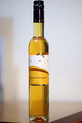
Southern Highlands Wines 2008 Botrytis Semillon
Another dessert wine. A few weeks ago we went on a day trip down to Berrima, a historic town on the old highway south from Sydney to Canberra and Melbourne. I remember having to drive through it on the way to Canberra many years ago and it was a nice place to stop for a morning tea of scones and cream. It’s since been bypassed and has reverted to a sleepy little village, but retains many charming features and has the usual sort of mix of antiques, crafts, art galleries, restaurants, and cafes to attract travellers and day-trippers.

As we discovered on this recent trip, it also has a wine shop, specialising in wines local to the southern highlands region of New South Wales. I hadn’t even realised that this was a wine growing region! They cover a scattered area ranging from about Bowral through to Canberra. Being highlands, they are high altitude, cool climate wineries, very different from the classic Australian hot and dry climate wine regions. I don’t know much about them, but presumably they grow stuff like sauvignon blanc and pinot noir. I’ll have to look into them a bit more closely over time.

Anyway, being a sucker for dessert wines, I picked up this bottle of Southern Highland Wines 2008 Botrytis Semillon. It’s very interesting to compare it to the other botrytised wines we’ve had recently. My wife really didn’t like this one as much, whereas I didn’t see much difference at first. It has an orangey aroma and taste, leading into the slight bitterness of marmalade. I quite liked it.

But a second glass brought out the differences. The previous couple of sweet wines we’ve drunk had a tingly prickle of fermentation on the tongue, whereas this one has none whatsoever. It’s a beautiful golden yellow colour, and thick and syrupy and sweet. Really not as much of that balancing marmaladey bitterness. And… simple for that. Not as complex and full of interesting flavours as the Tamburlaine Botrytis Chardonnay, nor particularly the McLeish Estate Jessica’s Botrytis Semillon.

I still like it – I have a real thing for these sweet dessert wines. But I like those other two more.

Riddoch 2006 Coonawarra Chardonnay

7 May, 2010

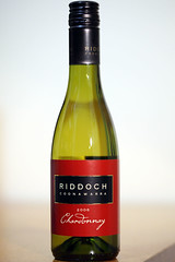
Riddoch 2006 Coonawarra Chardonnay
This is the second of two half-bottles we got in a wine club dozen through my work. We had the first at a local seafood restaurant some weeks ago, and we went back there tonight armed with this one. The first time I wasn’t too impressed – Chardonnay just seems too strong for me with its heavy oaky flavours. I tried hard to recognise anything else in this the first time,and failed.

This time, however, some of its subtleties started to make an impression on me. The back label claimed aromas of peaches and melons. Frankly, the first aroma that hit me was that typical oakiness. But after a few sniffs, I detected hints of rockmelon. I couldn’t get peach out of it though.

The flavour develops rapidly in the mouth. The initial taste is melony fruitiness, quickly giving way to that oak flavour, with a touch of smokiness. But then a tang comes out, like what I imagine gooseberries must be like (I’ve never actually had gooseberries, but I think I have a fair idea of what they must be like, given application of the term to other things I’ve tried.)

So I was unimpressed the first time around, but this time I could appreciate some of the different flavours, and that made it more enjoyable. I had it with a meal of soft-shell crab, served with a spicy Asian sauce and some steamed green vegetables. All very nice.

Photographing a Wedding

4 May, 2010

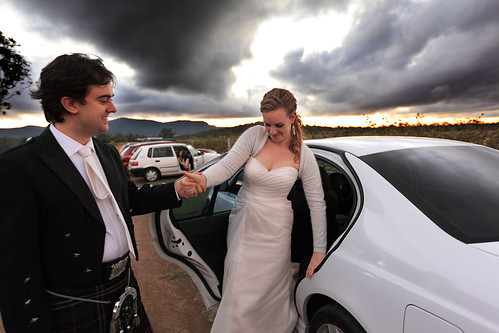
The newlyweds
Some time ago a friend asked me if I would do the official photography for his wedding. It would be a joint effort with another friend of ours. We agreed. The wedding was on Saturday.

I’ve taken a lot of photos at weddings, and done one other wedding as an “official” photographer (with the same friend who doubled with me on this recent one). Although I enjoy it, it’s hard work.

I’m best at taking photos of landscapes or architecture. Things that don’t move, in other words. I use the time that gives me to tweak things and try out different angles and exposures and compositions, and to generally take my time lining things up. You don’t get that luxury with people. If you don’t capture the moment, it’s gone. Even if you do capture it, you can get it wrong by under-exposing, over-exposing, or getting the focus wrong. And, on the other side of the coin, there are many moments you do end up capturing that have people blinking, or looking goofy, or are generally unflattering.

Taking portraits of people is not too bad in itself. If you have time to direct, compose, wait for them to look natural or laugh – rather than grinning stiffly into the camera – it works nicely. If you have time to look for interesting compositions and direct the subjects to stand here, move over there, look that way, etc.

At a wedding, you don’t have a lot of that time. People are rushing about, trying to stick to a schedule that inevitably slips. They’re nervous, or thinking about other things, rather than relaxed and ready to be directed and sit still for several minutes at a time. Much of the time you just have to get in there and fire away with your camera.

I’m sure you can get better at it. Plenty of people make a living out of shooting weddings. But you know, seeing some of those wonderful creative shots of happy couples or bridal parties in scenic surroundings and dynamically posed makes me realise just how much time and effort and thought must have gone into those shots. You can’t just take a bride and groom into a garden for half an hour and get a drop-dead gorgeous photo. You need to plan it, and you need to direct the subjects. You need to stop time for them and have the luxury of an hour or two where there’s no rush to be somewhere else or worries about what’s next on the schedule.

Sometimes I think the best wedding photography isn’t done on the wedding day at all. It’s just too hectic. It has to be staged as a photo shoot, without all that other stuff happening around it.

To really do a wedding justice in photographs, I wish I had more time. Oh, I’m pretty happy with some of the shots I got this time. There are just some where I wish I’d had a bit more time to adjust things to get the shot perfect. This is not to complain. The day is for the happy couple, after all, and forcing them to bow to the whims of a photographer is not conducive to stress minimisation.

Maybe I just need more practice.

100 ideas in 100 days

28 April, 2010

I’ve said before that not everyone can make a webcomic. Oh, plenty of people say they could make one if they wanted to. They say they’ve got loads of ideas, and all they have to do is put them together and post them. Only they don’t actually put them together and post them. Because that’s the hard part – actually doing the work. Coming up with the ideas is the easy bit.

This is not to denigrate the generation of ideas. That can be tricky if you’re not used to how your own creative juices flow and to capturing those fleeting thoughts we all have dozens of times a day. There is a skill involved in that. But the point is that if you’re tuned in to your idea generation engine (i.e. your imagination), then you can generate lots of ideas pretty easily.

Olaf Solstrand is in the middle of posting 100 ideas in 100 days on his blog. Not any old ideas. Ideas for webcomics. A hundred different ideas for webcomics. Some of them are so good that I want to run out and do them. Except I don’t have the time.

If you’re sitting there thinking you could do a webcomic, grab one of Olaf’s ideas and run with it. No, seriously. I’d like to see some of those turned into comics. There are ideas in abundance. What we lack is the time and resources needed to make them into finished products.

This is the lament of creative people.

Vetting Ideas

25 April, 2010

At my work recently we had a staff competition to design creative new features for digital cameras. I briefly thought of entering, but didn’t in the end. This resulted in me being approached to act as one of the judges (of five).

The judging process was interesting. One overriding criterion was that the ideas had to be novel. We work for Canon, an electronic imaging company, so the competition was strongly aligned to our corporate strength, and the goal was to encourage new ideas that could potentially be converted into real, new products. So the novelty criterion was primary. Anything that other camera companies had done was out. Anything that someone had patented already was out. Anything that had been described in a scientific paper, or advertising, or even on someone’s blog, was out. The ideas had to be something that, as far as we could discover, nobody had ever presented before.

Once we’d eliminated anything that we could find prior presentations for, we had to decide the ranking of ideas in order of various creativity and practicality criteria. And this is where the arguments started. (Well, there was no shouting or anything, it was more like spirited discussion. The whole judging process was handled well by all involved.) The disagreements centred on whether people thought certain ideas were “cool” or “I’d never use that feature” or “this would actually be annoying if my camera did this”.

There were a couple of ideas that two of the judges thought were really creative and clever and that people would love, but which other judges just thought were ridiculous and that nobody would ever want such a feature on a camera. The point here, as we more or less agreed after some discussion, was that the market for cameras is huge, and is extremely diverse. What a serious amateur wants on a camera to take artistic photos is very different from what a teenager wants on a camera to take snapshots to post on Facebook. One idea in particular, a couple of judges were naysaying, claiming that such a feature would just annoy the user and nobody would ever buy a camera with that on it. I and another judge countered that teenagers and kids would positively love it, and would actively seek such cameras.

Bringing this back to my topic, in general ideas aren’t universally good or bad. Just because someone doesn’t like your idea doesn’t mean it’s a bad idea. People like finding faults in things, they like deconstructing them and picking all the bits that don’t appeal to them. This is not to say that your idea is brilliant – it might actually be a bad idea – but just that you shouldn’t dismiss it on the opinion of one person. There may well be an audience out there for it somewhere. If you think it’s worth pursuing, then that’s one person who appreciates it. And where there’s one, there can be more.

Purple Hen 2008 Cabernet Sauvignon

25 April, 2010

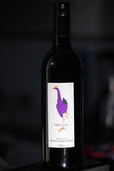
Purple Hen 2008 Cabernet Sauvignon
I got this bottle as a birthday gift. It’s from Phillip Island – I didn’t even know they made wine there! I like the label. It reminds me of a purple swamphen – in fact looking at it now, I’m pretty sure that’s exactly what it’s meant to be.

Anyway, there was no difficulty in picking the dominant aroma with this one. One big sniff and my wife immediately declared “blackcurrant!” It was like taking a big whiff of Ribena. After a bit more analysis and thought, I also came up with cut grass, which my wife gave a thoughtful nod to.

In the mouth, the first thing that hits you is the oak. I’m not a big fan of oak, and this was pretty strong. Then there was the inevitable fruity flavour, with perhaps a hint of smokiness. And bringing up the rear a slight tang of herbs. I’ve had a Cabernet or two before, but this one was beefy and powerful, a bit too strong and “raw” for my taste. At this point I really don’t know exactly how aging changes the character of a wine, but I get the impression that it can take the hard edge off the strong flavours and give a more rounded mellowness to the result. I think that’s what this needed. Not bad… just a bit too strong, particularly the oak.

During the night after drinking this, I had a strange dream, in which I was examining the bottle, and noticed that it had come in a champagne closure (in reality it was a screwcap), and the bottle bore signs of having been previously used. Removing the Purple Hen label revealed that it was an old Bollinger champagne bottle, apparently recycled. I have no idea what that means, except that I have strange dreams sometimes!

On Puzzle Hints

19 April, 2010

Once again my friends and I are organising the annual CiSRA Puzzle Competition, which has just opened for team registration. Part of the process of running such a competition is of course creating the puzzles, which is a lot of fun.

Another part, for the sake of the competition format, is writing a series of 3 hints for each puzzle. The puzzles are worth points, and the point value decreases as more hints are released over time. We’ve actually spent many hours discussing (or arguing may be a more accurate term) how to approach the writing of hints.

A major problem with trying to run a competition like this and writing suitable hints is that we get feedback from participants criticising the structure of the hints. In particular, people strongly dislike it when they feel they have done most of the hard work involved in solving a puzzle, and are stuck at the final step, and we release the first hint, and it tells them about one of the initial steps of the puzzle – a step they already figured out with their own effort.

This is understandable. We’ve felt exactly the same frustration ourselves when participating in other puzzle competitions. When you’ve put in hard work and figured something out by yourself, the last thing you want to see is a hint that lets the other teams who haven’t figured it out yet catch up to where you are. What you really want is a hint that helps you. Ideally a hint that helps you and nobody else!

We could write hints so that the first hint helps people stuck at the final hurdle in the puzzle, and only later hints give away the earlier bits of the puzzle. But what does that mean? It means we’re helping the good teams. The teams full of strong puzzle solvers, who are already ahead of most of the pack, because they’ve probably already solved a bunch of other puzzles that other teams are still struggling with. And we’re not helping the weak teams – the ones who really need a kick start to even know what the first step in the puzzle is. If we did this, the effect would be to boost the strong teams and give nothing to the weaker teams. It would be making the already strong teams “win more”.

On the other hand, we can structure the hints so that the first hint helps people with the first step of the puzzle, the second hint helps with an intermediate step, and the final hint helps with the final step. What does this approach do? It helps the weaker teams to get a leg up on puzzles that they were really having difficulty just starting on. It doesn’t help them with the rest of the puzzle.

Now if we assume the stronger teams have figured out steps 1 and 2 by themselves, maybe 20 hours ago, and a weak team is now given a helping hand with step 1 by the first hint, while the first hint doesn’t help the stronger teams… do you know what? The stronger teams will still generally solve the puzzle first! They still have the advantage of being better puzzle solvers, and the extra advantage of 20 more hours to cogitate on the final step. Hints that help the weaker teams just level the field a little bit. They don’t help weak teams to beat strong teams.

And levelling the field a bit is useful. Imagine you’re on a team that is struggling to figure out how to even start a puzzle. A day later the first hint is revealed, and it’s a big hint for the final step of the puzzle – a step you’re not even up to yet! It helps the strong teams, not you! That’s discouraging – you’re falling even further behind. You may as well give up on this lousy competition.

So hints that step through the puzzle in order are useful to encourage teams to stay in the competition. They flatten the point spread a bit. And they don’t really hurt the best teams – the ones who are (understandably) a bit frustrated that the other teams are “catching up” thanks to hints. Because, I’ll say it again, the best teams are going to solve those hard puzzles before the weaker teams anyway. When the last hint comes out that gives the game away, the strong teams will still beat the weak teams who have been guided through the early steps by the first two hints.

So that’s the main principle we use when writing hints. We sometimes cop flak from strong teams who feel frustrated, but we’re okay with that. A second principle is that we also try to mitigate that a bit by making hints double-barrelled if we can. The first hint must provide a somewhat strongish clue about how to start the puzzle, but may also provide a more or less cryptic hint to getting past a later roadblock step. It should be slightly cryptic, to give us room to make it more obvious with a later hint.

I actually argued against doing this, but some of the other puzzle organisers were so adamant that we had to give something to the teams stuck on the last step that we adopted it as an option.

Anyway, the basic point of this post is that figuring out the philosophy of puzzle hint writing is difficult and full of contradictory pulls and opinions. It’s something we’ve actively spent time arguing over, to arrive at what I’d describe as a slightly uneasy truce, rather than total agreement. Further, this serves as an illustration that what many people may think of as some rather trivial consideration can be extremely complicated and involve deep questions of game-theoretical philosophy. If you’re serious about organising something like a puzzle contest, you’d better be prepared to think deeply about stuff like this.

Bernard Metrat Chiroubles 2004 Beaujolais

13 April, 2010

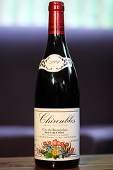
Bernard Metrat Chiroubles 2004 Beaujolais
French wine is, as I’ve learnt, labelled very differently to Australian wine. In particular, the labels don’t tell you what grape varieties are in the wine. What they have instead is a geographic region of origin, with an appellation name indicating a specific sub-style of wine from that region. The reasoning apparently goes that if you know anything about wine, then you know what sort of wine style each region/appellation makes, and don’t need to be told trivial things like what grapes they actually use.

For my first venture into this mysterious world, I decided to try some Beaujolais, from the Beaujolais region of France, naturally. This region is famous for making light, fruity red wines – so light they are typically served chilled like a white or rosé – out of gamay grapes. This sounded like a good way to expand my experience with different wine styles.

I visited a wine shop a few suburbs away for the first time, since it looked like it would have a better selection and more expert staff than anything local. This indeed turned out to be the case, with the guy behind the counter very enthusiastic and helpful, and as big a selection of Australian and foreign wines as I’ve seen. There were a few choices from Beaujolais, and I selected this mid-priced one pretty much randomly.

When I got home, I discovered that Chiroubles is one of the ten “Cru Beaujolais” designations, meaning a distinctive recognised sub-style of wine. In particular, Chiroubles is noted for being one of the lighter varieties, with aromas of flowers. Something to look for when tasting.

We took this bottle to a restaurant where I selected a pasta dish with chicken and a light sauce. And now here comes the difficult part. The first impression of the wine from sniffing it was that it smelled very similar to the sangria we sometimes get from a nearby Mexican restaurant. Very fruity – it smelled like red wine mixed with fruit. The problem is, try as hard as I might, I could not identify any particular fruit odour. Possibly raspberries, but equally possibly I was just deluding myself into thinking I could identify something. The first sniff is just not enough for me to really nail an aroma in a wine, and subsequent sniffs just dull the smell receptors in the nose, so that it gets more and more infuriatingly elusive.

The taste? Well, a similar story. Light and fruity at first, and enjoyable. Very much like sangria, in fact. Lots of “fruit”, but I couldn’t tell you what sort of fruit. It was pleasant on a quick swallow, but if you left it swirling in your mouth for a while, some tannin started to assert itself. It got stronger and stronger, until it was really quite strong. In fact, just now I’ve realised what it reminded me of – cold rosehip tea, with some extra tannin. Which is nice and refreshing in summer.

The wine was definitely enjoyable on the first glass. But a second glass became… unexciting. I guess that’s the unsophisticated nature of Beaujolais. I can see why it has a reputation as a light “picnic” wine.

Trusting in Science

8 April, 2010

Why do so many people distrust science, scientists, and informed scientific consensus so much?

Maybe it’s old news, but I had an insight into this when looking at some stuff about Riedel wine glasses. (This is not a wine post, really.) These glasses are marketed as “scientifically” designed to maximise the experience and enjoyment of drinking a glass of wine. What’s more, they have dozens of different glass shapes, each “designed” to work best for some particular type of wine. The upshot is – if you believe this – that to enjoy your wine to the maximum you need to buy about 8 different sets of Riedel glassware.

Many people can spot the conflict of interest here. Obviously it’s to Riedel’s advantage if it’s true that to best enjoy your cabernet sauvignon you need a different glass to the one you drink merlot from. So if they say it’s true, then even the mildly cynical can easily come to the conclusion that they’re just making it up.

And what about those wrinkle creams? You know the ones, that are advertised as “scientifically proven to reduce wrinkles by 78%”. How do you even measure that wrinkles have been reduced by 78%? Does anyone really believe that?

The culprit here is advertising. Advertisers like to use “science” to promote their products, because it has a veneer of authenticity that gets some people to trust their products. But most of us have become habituated to “scientific” claims by advertisers and just mentally filter them out or assign a low weight to them and evaluate the products on our own criteria. Science has become something that you can choose to believe if you want – and maybe you’re gullible if you believe it.

Unfortunately, that’s a misguided representation of science. When hundreds or thousands of experienced scientists agree that something is most probably true because of all the research, data collection, analysis, and peer review that they’ve put in, it’s not the same as a claim on a commercial. It actually has serious weight behind it, and you better take on board the idea that what they’re saying is more likely to be true than not. Yes, there are counterexamples, but they are few in a vast edifice of consistent, established scientific knowledge. The odds of any given piece of scientific consensus turning out to be incorrect are very small indeed.

The problem is, large swathes of laypeople who don’t fully understand how science operates simply look on it as another marketing move. They feel free to be cynical, and to completely disregard what the scientific consensus says. Especially if they don’t like what the message is, or it makes them uncomfortable in some way.

Science is about uncovering the truth, not about concocting stories designed to sell a product. Stories can be made palatable. The truth is different; it doesn’t always fit the way we want the world to work. Disbelieving it won’t make you immune from it. Science has checks and balances to make sure that mistakes or lies don’t get propagated. That’s why it’s such a huge scandal whenever a scientist is found to have falsified data or lied about a research result. This is the absolute capital sin of science, and when it is discovered it is treated accordingly. Careers in science can be ruined by one instance. You can be pretty sure that the vast majority of scientists out there are keeping their noses clean, and when they say they have research to support some conclusion, that they really do have solid data behind it.

Advertising is a completely different beast. Judging science by the standards you use to judge advertising is simplistic and misguided. But it’s a trap that more and more people seem to be falling into, alas.