Archive for the ‘Art’ Category

Photos of you

Thursday, 1 July, 2010

Here’s an idea. Determine a particular date when you were in a public place that is often photographed. Tourist spots are good examples.

Now use Flickr’s advanced search to find photos taken on that date, and tagged with something that narrows down the location appropriately.

See if you can find a photo taken by a complete stranger, with you in it. Let me know if you succeed!

On Contemporary Art

Saturday, 26 June, 2010

We went to the Museum of Contemporary Art this afternoon on the recommendation of a friend to check out the 2010 Biennale of Sydney exhibitions there. The Biennale is one of the premier regular art exhibitions in the world, so it was a nice way to spend a warm winter day and soak up some culture. It was interesting, and I’d recommend anyone with the chance go see some of the Biennale exhibits while they’re still around (until 1 August). There are also exhibits at other venues, such as the Art Gallery of New South Wales, and on Cockatoo Island, for which there are free ferries departing regularly from Circular Quay.

There are two things I wanted to comment on, about art in general. Firstly, as seems to be moderately common in exhibitions of contemporary art, some of the artworks were quite provoking. Children were allowed into the exhibition, but a sign at the entrance stated that some of the artworks were provocative, including imagery of highly sexual and violent natures, and that accompanying adults should supervise and guide any children in their exposure to and understanding of the works.

Now one of my (many) working definitions that forms the complex and fluid entity of my understanding of what “art” is, is “something that provokes a reaction”. Under this definition, there were some things in the gallery that I’m perfectly happy to call “art”. My problem is that some of them were things that I didn’t enjoy seeing. They provoked a reaction of repulsion in me. And this led me to wonder: Is something that makes you feel repulsed and wish that you’d never seen it, art?

I prefer art that makes me feel good when I see it. I like art that shows workmanship and makes me admire the skill needed to achieve it. I like art that looks nice and is pretty. I like art that I’d be happy to display in my home. I like art that makes me look twice and think, “Hmm, that’s interesting,” or, “Hmm, that’s weird,” or even, “What on Earth is that?” But there was some art here that made me think, “Euughgh! Take it away!” I didn’t like it, and I didn’t want to spend enough time looking at it to appreciate the work that went into it.

So it certainly provoked a reaction. But is it the right sort of reaction that art should be trying to provoke? Or is it just something that some people might appreciate and that I didn’t care for? I find it extremely hard to say that it shouldn’t be there in an art exhibition. I’m just wondering what the artist was actually trying to do. I can see provoking a reaction of disgust when trying to get across a message that something is bad (such as one item which was a bunch of statues with classical Dutch portrait features, smothered in crude oil – obviously a message about industrial pollution). But is the goal of provoking revulsion, merely to provoke revulsion and for no other reason, a valid goal for art?

Again, I think I have to say that it is valid. I can’t sanction telling people that what they’re creating isn’t art just because I don’t like it. I think it does have what it takes to be “art”. But I can’t avoid the sneaking suspicion that that’s not what art is supposed to be about. There should be more to it than just making people feel disgusted. Perhaps in these cases there was, but it was hard for me to see it. And look, if there was, then no problem. But… what if there wasn’t?

The second thing I wanted to talk about was video installation art. We saw a very cool piece by German artist Christian Jankowski, titled Tableaux Vivant TV. I won’t describe what it’s about, because anyone planning to see it should just see it. But the problem was it’s about 30 minutes long, and we came in about 2 minutes from the end. That was sort of okay, since we didn’t have to wait long to see it from the beginning, but unfortunately it spoiled the ending a bit, and it’s an ending that would have benefited from being unknown at the beginning.

I noticed that several of the artworks at the exhibition are videos. This is natural and to be expected, since we live in an age where video is a common medium for both documentary and artistic expression. But the medium of video is fundamentally different to the traditional static art media, and that, as I see it, is a serious problem. Because a video has a certain running time. Ideally you’d want viewers to see a video from the beginning, and stay to the end. But in an exhibition, the videos are usually on loops, and it’s far too easy to walk into the display room partway through the video. This spoils the experience of the artwork.

There are some solutions. You can make a video for which it doesn’t really matter if you come in partway through, or only stay for a fraction of the entire running time. There were some videos like this in the exhibition, and they worked reasonably well. But there were also some videos that told a definite story and that would really be best seen from start to finish. Jankowski’s was one of these. One solution would be to put a running timer on the door to the exhibition room, showing when the loop will restart. But none of the videos included this helpful device, so people were constantly wandering in and out, seeing part of this half-hour video, and not really understanding what was going on or getting the point of it. This seems an awful waste.

The other thing about video installations like this is that they demand a certain block of your time and attention. Art in a traditional static medium can be examined at any time, at your leisure, for as long or as little as you want. You are not being forced by the medium of the artwork to interact with it in a temporally constrained way. This is a powerful advantage, because you can spend half an hour studying a painting, or you can whisk by absorbing impressions rapidly. You can’t do that with a video – if you give it a minute of attention, you can come away with nothing whatsoever but bewilderment and a feeling that you’ve wasted your time because you couldn’t spend long enough there to properly get it.

I don’t have any answers for this. I just wanted to point out that I think these are serious problems for video art, and apparently there still don’t seem to be any good solutions in general for them.

Blue Mountains Day Trip

Monday, 14 June, 2010

Megalong Valley PanoramaWe went for a day driving trip up to the Blue Mountains yesterday. This is a World Heritage Area right on Sydney’s doorstep and contains some beautiful scenery.

There are just two roads out of Sydney to the west. We took the lesser travelled Bells Line of Road and turned off to the tiny village of Mount Wilson, where I’d never been before. It turned out to be tiny indeed, with just a few residential properties, a small church, and a Bush Fire Brigade building. No shops, no post office, nothing. The main reason for going there is to admire the beautiful gardens that many of the residents keep, and let open for public viewing. We dropped in at one, Windy Ridge, but being winter it wasn’t at its best. There were a few flowers out, but most of it was just various shades of green and brown. It was still interesting and would clearly be a wonder in spring.

We also stopped in at the Cathedral of Ferns for the short walk through luscious rainforest populated by enormous tree ferns, and then at Wynne’s Lookout for a view over part of the National Park.

From there we drove over to the Great Western Highway (the other route west from Sydney) and grabbed some pies for lunch at Mount Victoria, before heading out to Hargrave’s Lookout on the Shipley Plateau, south of Blackheath. The view from there is shown in the panorama at the top of this post. I’d not visited this spot before, but I’ll definitely be going back. It has possibly the best view of the Megalong Valley and Blue Mountains National Park regions that I’ve ever seen from any lookout spot.

On the way home, we popped in at Katoomba for some afternoon tea. I spotted a wine shop there and found some interesting regional NSW stuff. I bought 4 bottles: a late-picked Verdelho from Cowra, an ice wine from Orange, a bottle of spiced mead(!), and a bottle of hot chili wine – no grapes involved, it’s made entirely from chilis! The woman behind the counter saw me looking bemusedly at the bottle and offered me a taste. Wow… I had to buy a bottle after that. More details later when I give it a proper tasting.

Fan vitriol

Tuesday, 1 June, 2010

Being one of the creators of Darths & Droids, I take some time every now and then to trawl forums and blogs for new comments and reviews of the comic. The comments are generally good, although there are the odd few people who say, “I looked at it, it sucks.” But we can live with those.

One interesting trend I’ve noticed is just how much people seem to hate the Star Wars prequels. I mean not just dislike but actively hate. As in they think George Lucas went back in time and raped their childhood and shot their dog and the prequel films should be burnt, stabbed through the heart with a stake, and buried at a crossroads.

The slightly disturbing thing about this (besides that these people should try directing their passion into something positive for a change) is that it’s instantly leapt to when Darths & Droids is mentioned. A typical mention goes something like this:

Hey, check out this webcomic. It’s hilarious and it actually makes the prequels entertaining. This is the only possible justification for the existence of the prequels. Ha ha! look at the fun they’re poking of the stupid prequels! Hilarious!

Now, while it’s nice to have a reason why people like our comic, this actually worries me a bit. Because another thing that many of these posts seem to do is assume that we’re making fun of the prequels. As in just the prequels. I fear that many people haven’t read the FAQ, in which we state that we have a storyline plotted for all six movies.

What’s going to happen when we reach the end of Episode III, and start on Episode IV? Are people suddenly going to think we’ve stopped poking fun at the hated prequels and are now desecrating the original classics? I don’t know.

I’m not poking fun at the prequels because I hate them. They’re not masterpieces, and there are certainly groanworthy moments that are difficult to watch, but they’re still fun if you don’t treat them like they’re supposed to be the ultimate expression of cinema. I prefer the original trilogy, but I wonder how much of that is just nostalgia. There are also cringeworthy moments in those films.

As a resource for making the comics, we drew up a list of “Stupid things we need to explain” for each movie. People seem to think it’s hilarious when we point out how stupid something is in one of the prequels. Plot holes, bizarre character actions, ridiculous technology that defies physics and/or common sense, and so on. But you know what? We have lists of pretty much the same length of things just as stupid in each of the original trilogy films. When we use these to point out something silly in the original films and make jokes about it, what are the readers going to think?

Honestly, I wouldn’t be at all surprised if our readership dropped by half or more when we move from the prequels to the original trilogy. I hope it doesn’t, and that the story we are telling keeps readers hooked, and that the majority of people approach it with the same view of affectionate parody that we’re actually aiming for in the prequels, and stay to enjoy it. But I’m not sure that will happen. We’ll just have to wait and see.

Relaxing

Tuesday, 25 May, 2010

I was just thinking when was the last time I got home from work and did nothing but slump on the lounge and watch TV all night. Or at least the equivalent – just relaxing and essentially doing nothing but passive activities. And I can’t recall the last time that happened.

I’m always buzzing around, doing stuff. Making comics, or writing annotations, or composing puzzles, or tinkering away with code, or doing some 3D rendering – or writing blog posts. Occasionally I’ll do some housework or home maintenance stuff, or if I get really wacky I’ll start pulling out ingredients and make a batch of cookies or something. If I really don’t feel like doing any of those, and it comes down to the last resort, I go through my collection of unprocessed photos and play with them in Photoshop and post some to my Flickr page.

I don’t just kick back and say, “What’s on TV?” I watch some TV, when I know there’s something on that I want to watch. But I never channel surf. I’ve always got half a dozen more interesting things to do.

I’m beginning to think that for me, noodling around, playing with ideas, making things, doing creative activities – is relaxing. Sitting in front of a TV isn’t.

Photographing a Wedding

Tuesday, 4 May, 2010

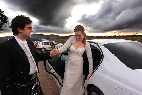
The newlyweds
Some time ago a friend asked me if I would do the official photography for his wedding. It would be a joint effort with another friend of ours. We agreed. The wedding was on Saturday.

I’ve taken a lot of photos at weddings, and done one other wedding as an “official” photographer (with the same friend who doubled with me on this recent one). Although I enjoy it, it’s hard work.

I’m best at taking photos of landscapes or architecture. Things that don’t move, in other words. I use the time that gives me to tweak things and try out different angles and exposures and compositions, and to generally take my time lining things up. You don’t get that luxury with people. If you don’t capture the moment, it’s gone. Even if you do capture it, you can get it wrong by under-exposing, over-exposing, or getting the focus wrong. And, on the other side of the coin, there are many moments you do end up capturing that have people blinking, or looking goofy, or are generally unflattering.

Taking portraits of people is not too bad in itself. If you have time to direct, compose, wait for them to look natural or laugh – rather than grinning stiffly into the camera – it works nicely. If you have time to look for interesting compositions and direct the subjects to stand here, move over there, look that way, etc.

At a wedding, you don’t have a lot of that time. People are rushing about, trying to stick to a schedule that inevitably slips. They’re nervous, or thinking about other things, rather than relaxed and ready to be directed and sit still for several minutes at a time. Much of the time you just have to get in there and fire away with your camera.

I’m sure you can get better at it. Plenty of people make a living out of shooting weddings. But you know, seeing some of those wonderful creative shots of happy couples or bridal parties in scenic surroundings and dynamically posed makes me realise just how much time and effort and thought must have gone into those shots. You can’t just take a bride and groom into a garden for half an hour and get a drop-dead gorgeous photo. You need to plan it, and you need to direct the subjects. You need to stop time for them and have the luxury of an hour or two where there’s no rush to be somewhere else or worries about what’s next on the schedule.

Sometimes I think the best wedding photography isn’t done on the wedding day at all. It’s just too hectic. It has to be staged as a photo shoot, without all that other stuff happening around it.

To really do a wedding justice in photographs, I wish I had more time. Oh, I’m pretty happy with some of the shots I got this time. There are just some where I wish I’d had a bit more time to adjust things to get the shot perfect. This is not to complain. The day is for the happy couple, after all, and forcing them to bow to the whims of a photographer is not conducive to stress minimisation.

Maybe I just need more practice.

100 ideas in 100 days

Wednesday, 28 April, 2010

I’ve said before that not everyone can make a webcomic. Oh, plenty of people say they could make one if they wanted to. They say they’ve got loads of ideas, and all they have to do is put them together and post them. Only they don’t actually put them together and post them. Because that’s the hard part – actually doing the work. Coming up with the ideas is the easy bit.

This is not to denigrate the generation of ideas. That can be tricky if you’re not used to how your own creative juices flow and to capturing those fleeting thoughts we all have dozens of times a day. There is a skill involved in that. But the point is that if you’re tuned in to your idea generation engine (i.e. your imagination), then you can generate lots of ideas pretty easily.

Olaf Solstrand is in the middle of posting 100 ideas in 100 days on his blog. Not any old ideas. Ideas for webcomics. A hundred different ideas for webcomics. Some of them are so good that I want to run out and do them. Except I don’t have the time.

If you’re sitting there thinking you could do a webcomic, grab one of Olaf’s ideas and run with it. No, seriously. I’d like to see some of those turned into comics. There are ideas in abundance. What we lack is the time and resources needed to make them into finished products.

This is the lament of creative people.

Vetting Ideas

Sunday, 25 April, 2010

At my work recently we had a staff competition to design creative new features for digital cameras. I briefly thought of entering, but didn’t in the end. This resulted in me being approached to act as one of the judges (of five).

The judging process was interesting. One overriding criterion was that the ideas had to be novel. We work for Canon, an electronic imaging company, so the competition was strongly aligned to our corporate strength, and the goal was to encourage new ideas that could potentially be converted into real, new products. So the novelty criterion was primary. Anything that other camera companies had done was out. Anything that someone had patented already was out. Anything that had been described in a scientific paper, or advertising, or even on someone’s blog, was out. The ideas had to be something that, as far as we could discover, nobody had ever presented before.

Once we’d eliminated anything that we could find prior presentations for, we had to decide the ranking of ideas in order of various creativity and practicality criteria. And this is where the arguments started. (Well, there was no shouting or anything, it was more like spirited discussion. The whole judging process was handled well by all involved.) The disagreements centred on whether people thought certain ideas were “cool” or “I’d never use that feature” or “this would actually be annoying if my camera did this”.

There were a couple of ideas that two of the judges thought were really creative and clever and that people would love, but which other judges just thought were ridiculous and that nobody would ever want such a feature on a camera. The point here, as we more or less agreed after some discussion, was that the market for cameras is huge, and is extremely diverse. What a serious amateur wants on a camera to take artistic photos is very different from what a teenager wants on a camera to take snapshots to post on Facebook. One idea in particular, a couple of judges were naysaying, claiming that such a feature would just annoy the user and nobody would ever buy a camera with that on it. I and another judge countered that teenagers and kids would positively love it, and would actively seek such cameras.

Bringing this back to my topic, in general ideas aren’t universally good or bad. Just because someone doesn’t like your idea doesn’t mean it’s a bad idea. People like finding faults in things, they like deconstructing them and picking all the bits that don’t appeal to them. This is not to say that your idea is brilliant – it might actually be a bad idea – but just that you shouldn’t dismiss it on the opinion of one person. There may well be an audience out there for it somewhere. If you think it’s worth pursuing, then that’s one person who appreciates it. And where there’s one, there can be more.

On Puzzle Hints

Monday, 19 April, 2010

Once again my friends and I are organising the annual CiSRA Puzzle Competition, which has just opened for team registration. Part of the process of running such a competition is of course creating the puzzles, which is a lot of fun.

Another part, for the sake of the competition format, is writing a series of 3 hints for each puzzle. The puzzles are worth points, and the point value decreases as more hints are released over time. We’ve actually spent many hours discussing (or arguing may be a more accurate term) how to approach the writing of hints.

A major problem with trying to run a competition like this and writing suitable hints is that we get feedback from participants criticising the structure of the hints. In particular, people strongly dislike it when they feel they have done most of the hard work involved in solving a puzzle, and are stuck at the final step, and we release the first hint, and it tells them about one of the initial steps of the puzzle – a step they already figured out with their own effort.

This is understandable. We’ve felt exactly the same frustration ourselves when participating in other puzzle competitions. When you’ve put in hard work and figured something out by yourself, the last thing you want to see is a hint that lets the other teams who haven’t figured it out yet catch up to where you are. What you really want is a hint that helps you. Ideally a hint that helps you and nobody else!

We could write hints so that the first hint helps people stuck at the final hurdle in the puzzle, and only later hints give away the earlier bits of the puzzle. But what does that mean? It means we’re helping the good teams. The teams full of strong puzzle solvers, who are already ahead of most of the pack, because they’ve probably already solved a bunch of other puzzles that other teams are still struggling with. And we’re not helping the weak teams – the ones who really need a kick start to even know what the first step in the puzzle is. If we did this, the effect would be to boost the strong teams and give nothing to the weaker teams. It would be making the already strong teams “win more”.

On the other hand, we can structure the hints so that the first hint helps people with the first step of the puzzle, the second hint helps with an intermediate step, and the final hint helps with the final step. What does this approach do? It helps the weaker teams to get a leg up on puzzles that they were really having difficulty just starting on. It doesn’t help them with the rest of the puzzle.

Now if we assume the stronger teams have figured out steps 1 and 2 by themselves, maybe 20 hours ago, and a weak team is now given a helping hand with step 1 by the first hint, while the first hint doesn’t help the stronger teams… do you know what? The stronger teams will still generally solve the puzzle first! They still have the advantage of being better puzzle solvers, and the extra advantage of 20 more hours to cogitate on the final step. Hints that help the weaker teams just level the field a little bit. They don’t help weak teams to beat strong teams.

And levelling the field a bit is useful. Imagine you’re on a team that is struggling to figure out how to even start a puzzle. A day later the first hint is revealed, and it’s a big hint for the final step of the puzzle – a step you’re not even up to yet! It helps the strong teams, not you! That’s discouraging – you’re falling even further behind. You may as well give up on this lousy competition.

So hints that step through the puzzle in order are useful to encourage teams to stay in the competition. They flatten the point spread a bit. And they don’t really hurt the best teams – the ones who are (understandably) a bit frustrated that the other teams are “catching up” thanks to hints. Because, I’ll say it again, the best teams are going to solve those hard puzzles before the weaker teams anyway. When the last hint comes out that gives the game away, the strong teams will still beat the weak teams who have been guided through the early steps by the first two hints.

So that’s the main principle we use when writing hints. We sometimes cop flak from strong teams who feel frustrated, but we’re okay with that. A second principle is that we also try to mitigate that a bit by making hints double-barrelled if we can. The first hint must provide a somewhat strongish clue about how to start the puzzle, but may also provide a more or less cryptic hint to getting past a later roadblock step. It should be slightly cryptic, to give us room to make it more obvious with a later hint.

I actually argued against doing this, but some of the other puzzle organisers were so adamant that we had to give something to the teams stuck on the last step that we adopted it as an option.

Anyway, the basic point of this post is that figuring out the philosophy of puzzle hint writing is difficult and full of contradictory pulls and opinions. It’s something we’ve actively spent time arguing over, to arrive at what I’d describe as a slightly uneasy truce, rather than total agreement. Further, this serves as an illustration that what many people may think of as some rather trivial consideration can be extremely complicated and involve deep questions of game-theoretical philosophy. If you’re serious about organising something like a puzzle contest, you’d better be prepared to think deeply about stuff like this.

Up at Dawn

Tuesday, 30 March, 2010

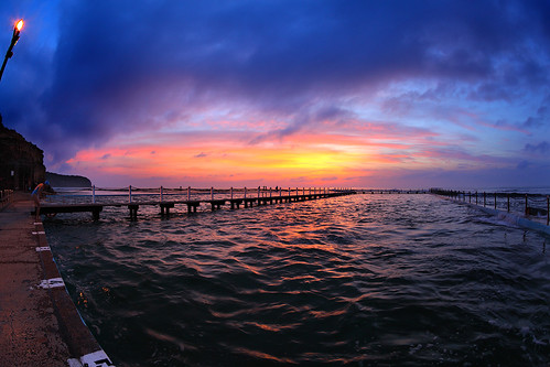
The Swimmer
On Sunday I got up at 5:20. The aim was to be out at North Narrabeen while it was still dark, so I could do some sunrise photography. This is the best time of year to do this, because the sun is rising later as winter approaches, but daylight saving hasn’t ended yet, so the sun is actually appearing later (by the clock) than in the middle of winter. And being the tail end of summer, it isn’t nearly as cold in the morning either.

What you want for a good sunrise is a bit of cloud in the sky, but a clear horizon, without that band of grey wall you sometimes get hovering right on the horizon. If there’s no cloud, the sky just goes bland, but some clouds catch the red glow of the dawn sun and provide some contrast in the sky. The problem is, because you have to get up and head out when it’s still dark, you have no idea what the sky is going to be like when the sun finally appears. So it’s always a gamble. So far I’ve been very lucky with my dawn photo sessions – I haven’t really had a bad one yet.

The other thing is that I live on an east coast, which means that yes, I have to get up at dawn for the sunrise. The sun sets beyond the suburbs and the mountains in the distance, which isn’t nearly as good as the sun setting into the ocean. If you’re on a west coast, you get good sunsets; if you’re on the east, you need to go for the sunrises.

And finally, taking photos on the coast, you need to consider the tide. Yes, something I do cares about the phase of the moon. (And I’m not a fisher or a surfer. Actually, I used to care about the phase of the moon when I did astronomy too.) It happened to be high tide at dawn on Sunday, which meant much of the rock platform I was taking photos of was submerged. There were about half a dozen other photographers there – photography is a dawn fraternity – and all of them were simply wading through the sea water to access positions on the edge of the rocks, where waves could wash over them and provide luscious photos. I still need to get some shoes I’m willing to inflict sea water on, so I stayed on the relatively dry area around the rock pool.

Then there’s the choice of lens. I like to experiment and try unconventional things. One of the tricks is a fisheye lens. It distorts the image wildly, and is often used in ways which accentuate the effect, by including lots of obvious lines that get bent. But if you put the horizon bang in the middle of the frame, it stays straight. And if there are few straight lines elsewhere, the image can look reasonably natural. There is some obvious distortion in this shot, but it’s confined to the corners and doesn’t scream at you.

And the other cool thing about being here at dawn is that swimmers get up at the same time and provide interesting foreground subjects, to set against the magic that’s happening in the sky.

It’s good to get up early.